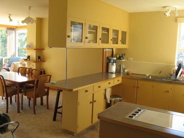
First order of business when I bought the house was to change the colour scheme. Last painted in the late 80’s the butter cream yellow and autumn toned kitchen had gone well with the 1975 autumn toned carpet but not as well with the newer pink toned cream carpet laid in the mid 90’s.

A few years back when everyone started painting their walls white I thought they were crazy. I thought I’d be the last person on earth to paint my house white. Somehow, by the time I owned some walls I was hankering after a nice light neutral but not white. I’d never use white. I’d never decorate with greens either. Oh how we change.
I spent months looking at colour charts. Next door was so neutral coloured it was basically monotone. I didn’t want that. In fact I had feature walls in mind for most of the rooms. But what colours? I don’t like browns. I hate pinks. I’ve seen some nice reds, but they’re not really me, besides I wanted a relaxing home, not an angry colour. No yellows or creams – too close to the 90’s colours.
I looked at HUNDREDS of colour scheme room photos. Not one of them worked with the amount of varnished wood in this house. Mantles, window sills, skirting boards, bookshelves, entire glass walls surrounded with timber, and I was just about to expose a lot of the floors – more Tassie Oak (Eucalypt), all of it in shades of orange. I pulled out the colour wheel and looked for complimentary colours for orange. Greenish blues. Hmm, well I quite liked the ocean…
A lot of sites recommended taking a colour scheme from a loved object, like a bowl or artwork. Everything I owned was bought to go with my mother’s colour scheme so that wouldn’t work. Then one day I saw a cushion in Coles that I quite liked. A couple of weeks later it was reduced to half price. I figured it was a $4 sign. I knew what my main colour and my neutral looked like now.
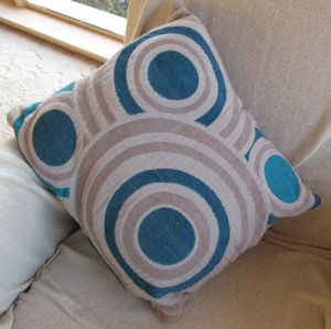
This was about a year before the teal blues really started appearing in the stores and colour schemes (wow, I’ve never ever been ahead of a trend before!)
Now to actually find them in paints. I spent weeks with colour cards propped against all surfaces. Dulux Azure blue was one of the cards (there were about 15 all in the same range of greenish blues. It’s scary contemplating painting with such an intense shade though. Plus I have blues in the kitchen laminex and the kitchen floor and I didn’t want them to clash.
Indecision reigned and the off whites remained completely elusive. Everything was too brown, or too cold in tone or it was a cream.
And then there was the bedroom. The master bedroom was a hideous shade of salmon pink. It needed to be changed. It also needed to be different to the rest of the house. It had to be my haven, not just another room. Since I was somewhat reluctant to move into this bedroom it also had to be something I absolutely adored, AND completely different from my old room (which had been a light sandy peach for decades, and before that a wisteria mauve.)
One single colour scheme photo struck a chord as far as the bedroom went. From the moment I saw it I was hooked. It was in a Wattyl ‘Inspiring Designs’ booklet. (Most of them inspired me to yawn or throw up.)
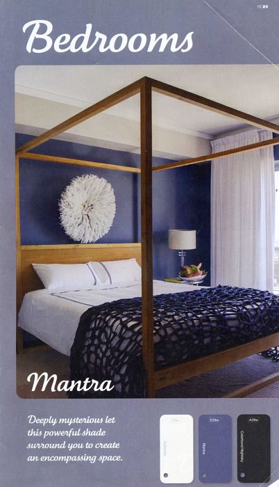
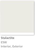
Wattyl Mantra looked perfect in the image and I loved the idea of black (Colourbond Nightsky is a fancy name for black) accents – although when I finally worked out that the throw rug wasn’t black the only possible black in that photo is a few centimetres of skirting board visible under the bed. When I got a sample pot of Stalactite though I discovered it was as white as it looked on the page. So obviously the ceiling. But was was that wall colour above the blue? A half dozen sample pots later and long sessions with the colour atlas and the aisles of sample cards and I was no nearer finding out. Colours that looked perfect during the day in the bedroom looked like cold sandstone or cement at night. Colours that looked great at night didn’t go with the Mantra in the daylight.
Apart from spending a fortune on sample pots I was running out of time. I wanted to have the majority of the painting done in the lounge, hall and bedroom before I got the floors refinished and I had an annual ‘party’ in early December and I really wanted the painting mostly done by then. Then suddenly I had a confirmed date that the guy would be coming in with the sander.
I hated the idea of paying someone else to choose my paint colours. I’m fairly good with colours, I like playing around with them. So it especially hurt that I was about to employ someone to essentially pick out two shades of white!
Calling Fiona , the local Dulux colour consultant was probably the best decorating decision I ever made. The hour and a half that she fitted in at extremely short notice was invaluable. Not only did she find three ‘neutrals’ that I just love but she helped me decide upon the azure blue for the living room, made a heap of decorating suggestions as we chatted, redid the entire exterior colour scheme and was so enthusiastic about all my plans and ideas that I could have happily chatted all day. It was nice to have someone validate my choices without suggesting I use “Hog bristle” (I could NOT use that colour, I’d think of the name every time I saw it), or stating that I’d never be able to sell the place with a dark colour on the walls (hello, I just BOUGHT the place, please leave defeatist attitudes at the door.)
Fiona Dawson has, unfortunately for those of us in Tassie, moved to Queensland, and can be found at Dawsons Designs or on Facebook
After the consult I went straight out and bought the paint, no more mucking around with sample pots, these colours were going to have to do. I put the first coat of Dulux White Duck (Half strength) on the lounge wall and thought I’d made a HUGE mistake. It was green. Like duck egg green. Too bad, I had the paint, so on went the second coat.
It’s not green, not even slightly, in any light. It is the most wonderful colour, almost white, but not. Not cream, but warm. Not grey, but neutral. I love it so much that the bedrooms and sunroom which originally weren’t going to change colour from the “Swiss Muesli” they had been for years, have now (or soon will) become White Duck half.
Check out the final schemes (Posts with accent colours and pics coming soon).
Bedroom
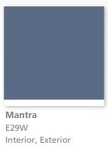


Wattyl Mantra double strength. (feature wall)
Dulux Domino (windows, skirting) Wattyl Stalactite (Ceiling – all the ceilings are this which is much brighter than the sample above shows on my screen)
Dulux Beige Royal half (Cupboards and neutral walls)
Living areas


Dulux Azure Blue
Dulux Lexicon Half (Trim)
Dulux White Duck Half
What’s your favourite colour scheme and how did you settle upon it?